
ContentFlow — UX/UI Case Study
Social Media Content Planning, Scheduling & Analytics Platform
Overview
ContentFlow is a social media planning and analytics platform designed for creators, freelancers, and small marketing teams.
The project aimed to explore how a modern SaaS landing page can communicate a product's value quickly while building trust and encouraging users to start a free trial.
Rather than focusing only on aesthetics, the challenge was to create a landing experience that balances product education, credibility, and conversion.
The Problem
Managing social media often requires jumping between multiple tools for content planning, scheduling, collaboration, and performance tracking.
Many existing solutions are either:
Too complex for small teams
Too expensive for independent creators
Focused on features rather than usability
As a result, users spend more time managing tools than managing content.
The challenge was to design a landing page that clearly communicates a simpler and more unified solution.
Goals
Business Goals
Clearly communicate the product's value within seconds
Increase free-trial sign-up intent
Build trust through product previews and social proof
Position ContentFlow as a modern and approachable alternative to traditional tools
User Goals
Quickly understand what the product does
Explore key features without feeling overwhelmed
See the product before committing
Easily evaluate pricing and next steps
Research & Key Insights
To better understand the space, I reviewed products such as Buffer, Later, and Hootsuite.
A few patterns stood out:
Users Scan Before They Read
Most visitors decide whether to continue exploring a page within a few seconds. Strong visual hierarchy and clear messaging are often more effective than lengthy explanations.
Product Visibility Builds Trust
Showing realistic dashboard previews helps users understand the product faster and creates confidence in the solution.
Simplicity Wins
Many competitors offer extensive functionality but present it in a way that feels overwhelming. A simpler experience can become a strong differentiator.
Wireframing & Exploration
Before moving into high-fidelity designs, I explored multiple layout variations to establish the page structure and content hierarchy.
The wireframing phase focused on:
Organizing information into a logical conversion flow
Prioritizing key product benefits
Determining placement of dashboard previews
Creating clear navigation between sections
Ensuring the page remained easy to scan
Several low-fidelity layouts were explored before selecting the final direction. This process helped validate content hierarchy and reduce visual clutter before investing time in visual design.
Key Areas Explored
Hero section layouts
Feature card arrangements
Dashboard showcase positioning
Pricing section hierarchy
Call-to-action placement
Final Design
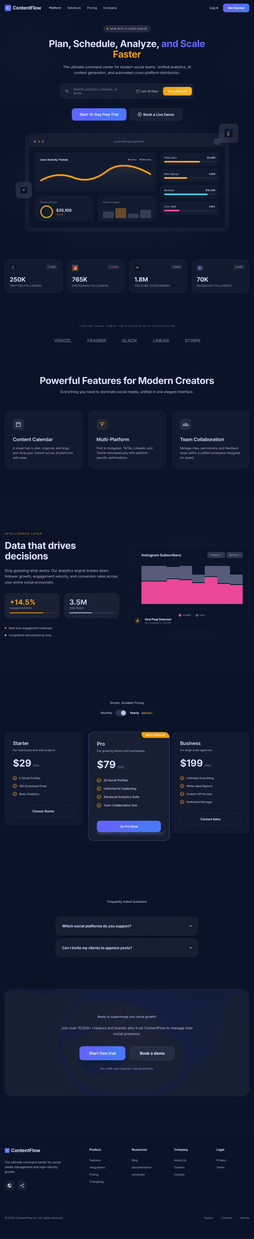
After validating the layout through wireframes, I designed a high-fidelity landing page focused on communicating product value, building trust, and encouraging trial sign-ups.
Final Landing Page
Highlights
Clear value proposition above the fold
Product-focused dashboard preview
Scannable feature sections
Data-driven analytics showcase
Transparent pricing structure
Multiple conversion touchpoints
Design Strategy
The landing page was structured around a simple conversion journey:
Awareness → Interest → Trust → Action
Each section was designed to answer a specific user question:
What is this?
How does it help me?
Can I trust it?
How much does it cost?
What's my next step?
This approach helped create a logical flow while reducing cognitive load.
Visual Design
For the visual direction, I chose a dark theme paired with purple and blue gradients to create a modern SaaS aesthetic.
Design System Highlights
Dark-first interface
Purple-blue gradient accents
12-column responsive grid
Glass-inspired card components
Consistent spacing and typography scale
Accessibility-conscious color contrast
The visual style was intentionally designed to make dashboard previews and analytics data feel more prominent while maintaining a premium look.
Key Design Decisions
Hero Section
The hero focuses on outcomes rather than features.
Instead of explaining every capability, the messaging immediately communicates the value of planning, scheduling, and growing social media content from one place.
A large dashboard preview was added to make the product feel tangible and trustworthy.
Product Showcase
A dedicated dashboard section highlights key functionality such as content planning, analytics, and campaign management.
This allows visitors to understand the product before reaching the sign-up stage.
Pricing & CTA
Pricing was made highly visible to reduce uncertainty and support faster decision-making.
Multiple call-to-action touchpoints were placed throughout the page to reduce friction and capture intent at different stages of the journey.
Challenges
Balancing Depth and Simplicity
ContentFlow offers multiple capabilities, but presenting everything at once created visual clutter.
To solve this, information was grouped into clear sections and supported by dashboard previews instead of long feature descriptions.
Creating a Premium Dark Theme
Dark interfaces can easily feel heavy if contrast and spacing are not carefully managed.
I used generous whitespace, subtle gradients, and lightweight card treatments to maintain clarity and visual balance.
Outcome
The final design demonstrates:
SaaS Landing Page Design
Information Architecture
Conversion-Focused UX
Design Systems Thinking
Visual Hierarchy
Responsive Design Principles
More importantly, it reflects how thoughtful UX decisions can support business goals while creating a clear and engaging user experience.
Reflection
This project reinforced the idea that effective landing pages are not just marketing assets—they are product experiences.
If I continue developing ContentFlow, I would:
Design the complete onboarding flow
Expand the dashboard experience
Create a scalable design system
Add motion and micro-interactions
Validate assumptions through usability testing
Skills Demonstrated
UI Design · UX Design · SaaS Design · Design Systems · Information Architecture · Landing Page Design · Conversion Optimization · Responsive Design

Thanks For Reading❤️
© 2026 portfolio @poojasree