Enhancing PhonePe’s Usability:
Improving Accessibility,
Navigation, and User Engagement
Duration to read : 10 min
Problem Statement
PhonePe users face significant challenges in quickly discovering and accessing core features, leading to delays in transactions, reduced efficiency, and frustration. Despite being a widely used platform, the app’s current navigation structure and feature placement make it difficult for users to perform essential tasks. This negatively impacts user satisfaction, engagement, and the overall transactional experience
Project Goal
The goal of this project is to simplify and enhance the PhonePe app’s user experience by improving navigation, making key features easier to find, and streamlining payment processes. Our focus is on reducing user effort, minimizing task completion time, and ensuring a smoother, more accessible experience for all users.

phonePe
Comparison of Old vs. New Home Screen: Enhancing User Navigation and Accessibility
Comparison of Old vs. New Home Screen: Enhancing User Navigation and Accessibility

Enhancing PhonePe’s Usability:
Improving Accessibility,
Navigation, and User Engagement
Duration to read : 10 min
Problem Statement
PhonePe users face significant challenges in quickly discovering and accessing core features, leading to delays in transactions, reduced efficiency, and frustration. Despite being a widely used platform, the app’s current navigation structure and feature placement make it difficult for users to perform essential tasks. This negatively impacts user satisfaction, engagement, and the overall transactional experience
Project Goal
The goal of this project is to simplify and enhance the PhonePe app’s user experience by improving navigation, making key features easier to find, and streamlining payment processes. Our focus is on reducing user effort, minimizing task completion time, and ensuring a smoother, more accessible experience for all users.
phonePe


Insight from Personal Experience and User Testing: Improving the Split Bill Feature and PhonePe’s UX
As a frequent PhonePe user, I once had to use the Split Bill feature for a bill I paid at a hotel. After creating the split, I realized there was no option to set a reminder for the bill. Being a shy person, I found it uncomfortable to directly message my friends about it. This led me to work on a feature that would allow users to easily remind others about unpaid bills.
During testing, I discovered that users were not only struggling with reminders but also had difficulty locating the Split Bill feature in the app. 7 out of 10 participants took around 2 minutes to find it. This highlighted a significant need for improvements in both the accessibility and discoverability of core features within PhonePe. Additionally, it became evident that many other areas of the app required a better user experience, prompting me to explore and address these UX challenges as well.
Below is an overview of the improvements I worked on based on these findings.
Primary Research Findings: Identifying User Pain Points and Challenges in PhonePe
As part of our primary research, we conducted a Google Form survey and usability testing with daily users of PhonePe. Through this, we identified several pain points that hinder the user experience:
Key Findings from Testing:
Users struggle to access the Scan and Pay feature: We observed that users found it difficult to access the Scan and Pay feature . during testing, which led to delays in completing transactions.
Lack of Search feature causes frustration: Users often expect a Search icon when they’re looking for an unfamiliar feature. When they couldn’t find it, they expressed disappointment and frustration, leading to a poor user experience.
No Remind feature for unpaid Split Bills: There is no easy way to remind users about unpaid split bills. As a result, users had to manually remind their friends, which created unnecessary friction.
Secondary Research Findings: User Feedback from Reddit, PlayStore and AppStore Reviews
As part of our secondary research, we analyzed PhonePe reviews on Reddit, PlayStore, and AppStore. A significant number of users expressed disappointment with the overall user experience of the app. Here are some of the key user complaints:
Insight from Personal Experience and User Testing: Improving the Split Bill Feature and PhonePe’s UX
As a frequent PhonePe user, I once had to use the Split Bill feature for a bill I paid at a hotel. After creating the split, I realized there was no option to set a reminder for the bill. Being a shy person, I found it uncomfortable to directly message my friends about it. This led me to work on a feature that would allow users to easily remind others about unpaid bills.
During testing, I discovered that users were not only struggling with reminders but also had difficulty locating the Split Bill feature in the app. 7 out of 10 participants took around 2 minutes to find it. This highlighted a significant need for improvements in both the accessibility and discoverability of core features within PhonePe. Additionally, it became evident that many other areas of the app required a better user experience, prompting me to explore and address these UX challenges as well.
Below is an overview of the improvements I worked on based on these findings.
Primary Research Findings: Identifying User Pain Points and Challenges in PhonePe
As part of our primary research, we conducted a Google Form survey and usability testing with daily users of PhonePe. Through this, we identified several pain points that hinder the user experience:
Key Findings from Testing:
Users struggle to access the Scan and Pay feature: We observed that users found it difficult to access the Scan and Pay feature . during testing, which led to delays in completing transactions.
Lack of Search feature causes frustration: Users often expect a Search icon when they’re looking for an unfamiliar feature. When they couldn’t find it, they expressed disappointment and frustration, leading to a poor user experience.
No Remind feature for unpaid Split Bills: There is no easy way to remind users about unpaid split bills. As a result, users had to manually remind their friends, which created unnecessary friction.
Secondary Research Findings: User Feedback from Reddit, PlayStore and AppStore Reviews
As part of our secondary research, we analyzed PhonePe reviews on Reddit, PlayStore, and AppStore. A significant number of users expressed disappointment with the overall user experience of the app. Here are some of the key user complaints:
Market Research: Comparing PhonePe, Google Pay, and Paytm
Through our market research, we compared PhonePe with Google Pay and Paytm to identify key UX improvements:
Google Pay offers a push notification system for unpaid split bills, allowing users to receive reminders, which I found very helpful. Inspired by this, I implemented a similar reminder feature for PhonePe.
Scan and Pay Accessibility: Paytm’s Scan and Pay feature is accessible with a single hand, making it more convenient for users, no matter the size of their phone. Google Pay, however, doesn’t follow this same accessibility standard, which might indicate different research and design guidelines.
Search Feature: Both Google Pay and Paytm offer a search icon, making it easy for users to find features. This is something PhonePe lacks, and it’s unclear why they haven’t implemented it yet.
In conclusion, both Google Pay and Paytm offer better UX in certain areas compared to PhonePe, especially in feature discoverability and accessibility.
Main Pain Points Identified: Navigational Challenges and UX Friction in PhonePe
Enhancing PhonePe’s User Experience: Streamlining Navigation and Key Features for Improved Accessibility and Functionality
Things to consider before creating wireframes
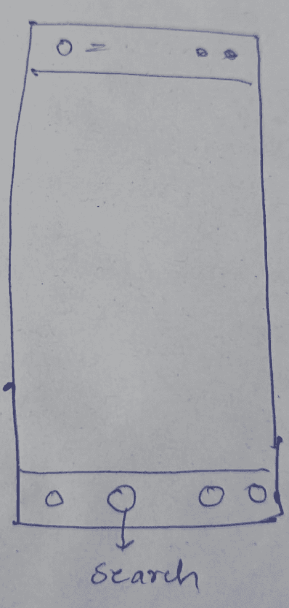
In the ideation phase, we focused on improving accessibility. Our research revealed that a significant portion of the screen, specifically the lower area, is more accessible for both left-handed and right-handed users.
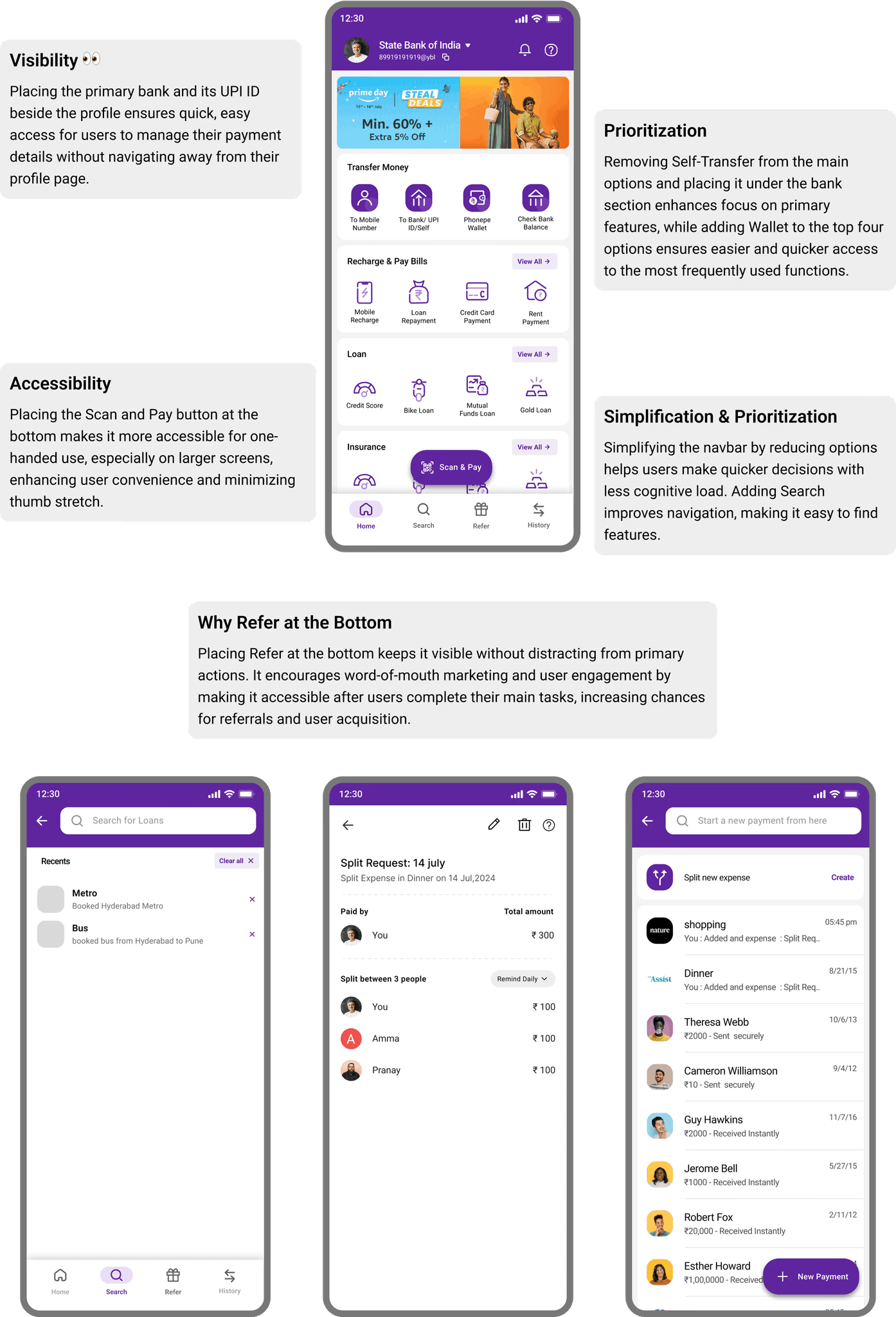
Based on this finding, we decided to place the Scan and Pay button in this easily accessible area, positioned centrally to ensure it is reachable with either hand or both hands. This change was made to enhance user convenience and streamline the payment process, making it more comfortable for users to complete transactions with one hand.
Below are the images and wireframes showcasing the new placement of the button and the design improvements.
Unpaid Bill Reminders
Lack of Search
Limited Accessibility
Unpaid Bill Reminders
Lack of Search
Limited Accessibility
Market Research: Comparing PhonePe, Google Pay, and Paytm
Through our market research, we compared PhonePe with Google Pay and Paytm to identify key UX improvements:
Google Pay offers a push notification system for unpaid split bills, allowing users to receive reminders, which I found very helpful. Inspired by this, I implemented a similar reminder feature for PhonePe.
Scan and Pay Accessibility: Paytm’s Scan and Pay feature is accessible with a single hand, making it more convenient for users, no matter the size of their phone. Google Pay, however, doesn’t follow this same accessibility standard, which might indicate different research and design guidelines.
Search Feature: Both Google Pay and Paytm offer a search icon, making it easy for users to find features. This is something PhonePe lacks, and it’s unclear why they haven’t implemented it yet.
In conclusion, both Google Pay and Paytm offer better UX in certain areas compared to PhonePe, especially in feature discoverability and accessibility.
Main Pain Points Identified: Navigational Challenges and UX Friction in PhonePe
Enhancing PhonePe’s User Experience: Streamlining Navigation and Key Features for Improved Accessibility and Functionality
Things to consider before creating wireframes
In the ideation phase, we focused on improving accessibility. Our research revealed that a significant portion of the screen, specifically the lower area, is more accessible for both left-handed and right-handed users.
Based on this finding, we decided to place the Scan and Pay button in this easily accessible area, positioned centrally to ensure it is reachable with either hand or both hands. This change was made to enhance user convenience and streamline the payment process, making it more comfortable for users to complete transactions with one hand.
Below are the images and wireframes showcasing the new placement of the button and the design improvements.
Limited Accessibility
Lack of Search
Unpaid Bill Reminders
Search Functionality in PhonePe: Exploring the Need and Feasibility
During usability testing, we found that users instinctively reached for the search bar when they couldn’t locate a feature. This highlighted the importance of implementing a search functionality in PhonePe. To better understand its feasibility, we asked the following questions:
1. Why hasn’t PhonePe implemented the Search feature yet?
2. Does the concept of a Search feature work well for PhonePe users?
3. If the Search feature works, will developers be willing to develop it?
4. If both the concept and the willingness are there, why hasn’t PhonePe implemented it yet?
Based on user behavior and the questions above, implementing a Search feature in PhonePe seems not only beneficial but necessary. It would enhance usability, enabling users to find features quickly and efficiently, thereby improving the overall user experience.
Remind Feature: Implementing a Simple and Effective Solution
During our ideation phase, we explored the Remind feature, inspired by Google Pay’s implementation. Google Pay’s reminder system, which sends push notifications for unpaid split bills, stood out for its simplicity and direct approach in solving user problems effectively.
Why Google Pay’s Reminder Feature:
Simplicity: Google Pay’s reminder feature is easy to understand and doesn’t overwhelm the user with unnecessary steps.
Usability: It provides an efficient way to remind friends about unpaid bills without any hassle, allowing the user to stay informed.
Direct Notifications: The push notifications are an effective and timely way to remind users without having to manually message their friends.
Our Implementation:
We decided to follow Google Pay’s approach but enhanced it by adding some personalized options, like customizing reminder frequency. Push notifications were integrated into the app to deliver seamless reminders to users.


Search Functionality in PhonePe: Exploring the Need and Feasibility
During usability testing, we found that users instinctively reached for the search bar when they couldn’t locate a feature. This highlighted the importance of implementing a search functionality in PhonePe. To better understand its feasibility, we asked the following questions:
1. Why hasn’t PhonePe implemented the Search feature yet?
2. Does the concept of a Search feature work well for PhonePe users?
3. If the Search feature works, will developers be willing to develop it?
4. If both the concept and the willingness are there, why hasn’t PhonePe implemented it yet?
Based on user behavior and the questions above, implementing a Search feature in PhonePe seems not only beneficial but necessary. It would enhance usability, enabling users to find features quickly and efficiently, thereby improving the overall user experience.
Remind Feature: Implementing a Simple and Effective Solution
During our ideation phase, we explored the Remind feature, inspired by Google Pay’s implementation. Google Pay’s reminder system, which sends push notifications for unpaid split bills, stood out for its simplicity and direct approach in solving user problems effectively.
Why Google Pay’s Reminder Feature:
Simplicity: Google Pay’s reminder feature is easy to understand and doesn’t overwhelm the user with unnecessary steps.
Usability: It provides an efficient way to remind friends about unpaid bills without any hassle, allowing the user to stay informed.
Direct Notifications: The push notifications are an effective and timely way to remind users without having to manually message their friends.
Our Implementation:
We decided to follow Google Pay’s approach but enhanced it by adding some personalized options, like customizing reminder frequency. Push notifications were integrated into the app to deliver seamless reminders to users.
UI Improvements: Designing an Intuitive and Accessible Interface for Seamless User Interaction
Key Takeaways from the Redesign
This case study highlights the importance of accessibility, intuitive navigation, and feature discoverability in enhancing user experience. Strategic design changes also balance usability improvements with business growth opportunities.
Thanks For Reading❤️
UI Improvements: Designing an Intuitive and Accessible Interface for Seamless User Interaction
Key Takeaways from the Redesign
This case study highlights the importance of accessibility, intuitive navigation, and feature discoverability in enhancing user experience. Strategic design changes also balance usability improvements with business growth opportunities.
Thanks For Reading❤️
© 2026 portfolio @poojasree
© 2026 portfolio @poojasree
© 2026 portfolio @poojasree
PS
UI/UX designer